The House
Overview
For The House, I was tasked with creating a comprehensive brand identity and marketing collateral that captured the essence of the project—one that speaks to creativity, community, and innovation. The goal was to design a cohesive visual language that would resonate with the target audience while remaining flexible across various mediums.

Brand Identity Design
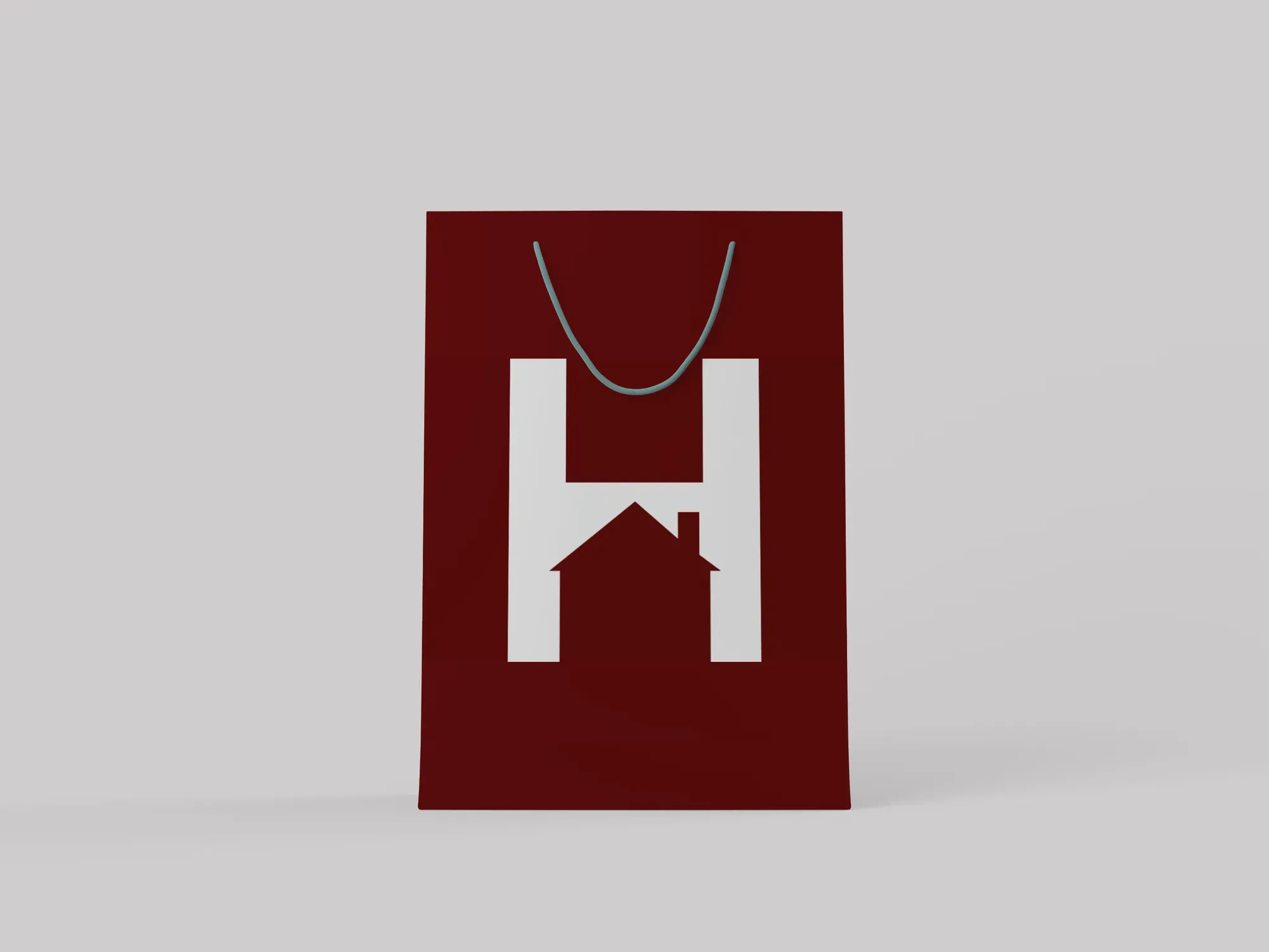
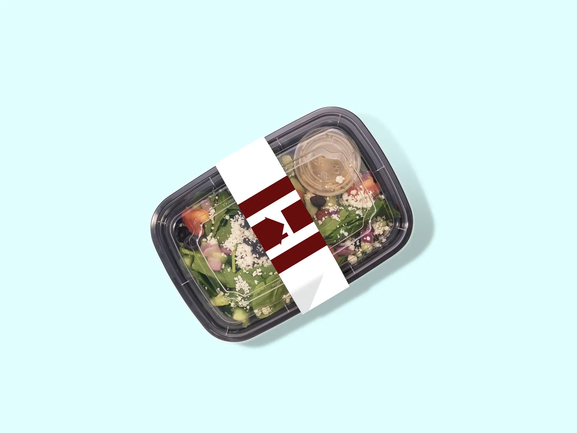
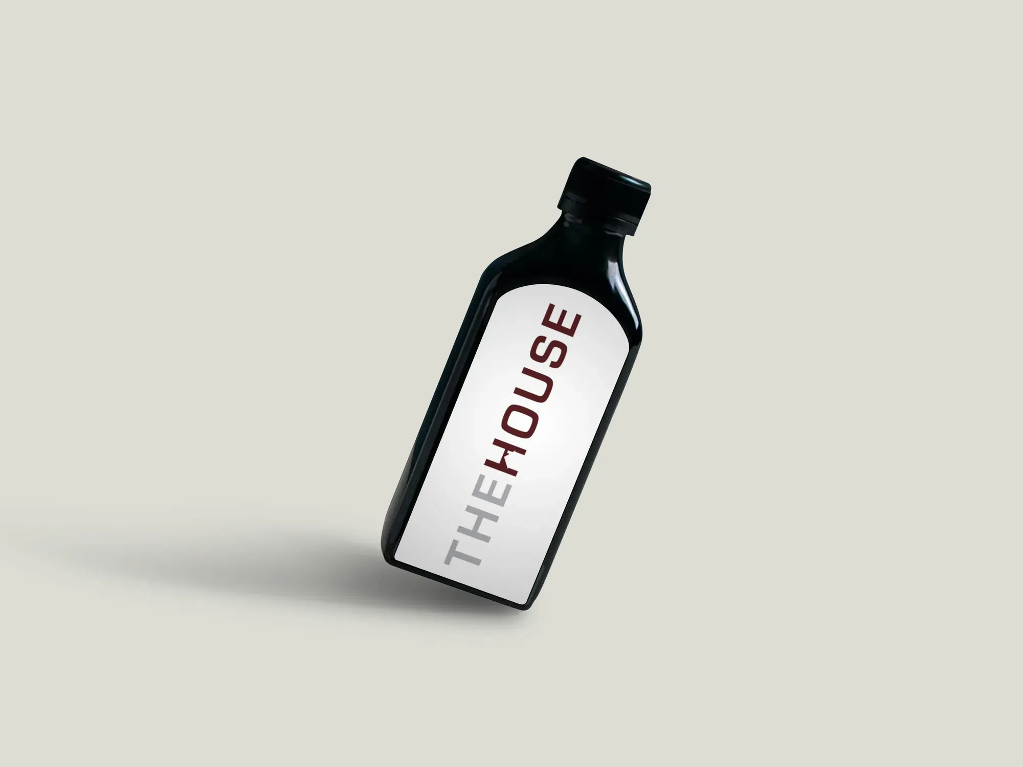
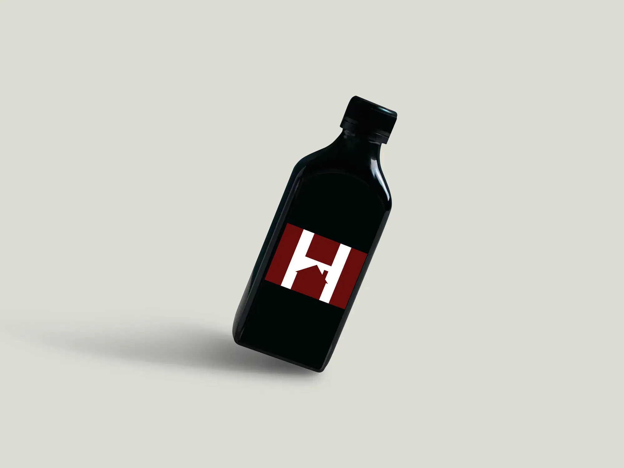
The brand identity for The House was built around modern, clean design principles with a focus on bold typography, dynamic shapes, and a fresh color palette. The logo was developed to convey a sense of inclusivity and creativity, while maintaining an approachable and professional tone. It was designed to be flexible, working seamlessly across different formats from print to digital, ensuring versatility while staying true to the brand’s core values.
Marketing Collateral – Poster and Cover Design
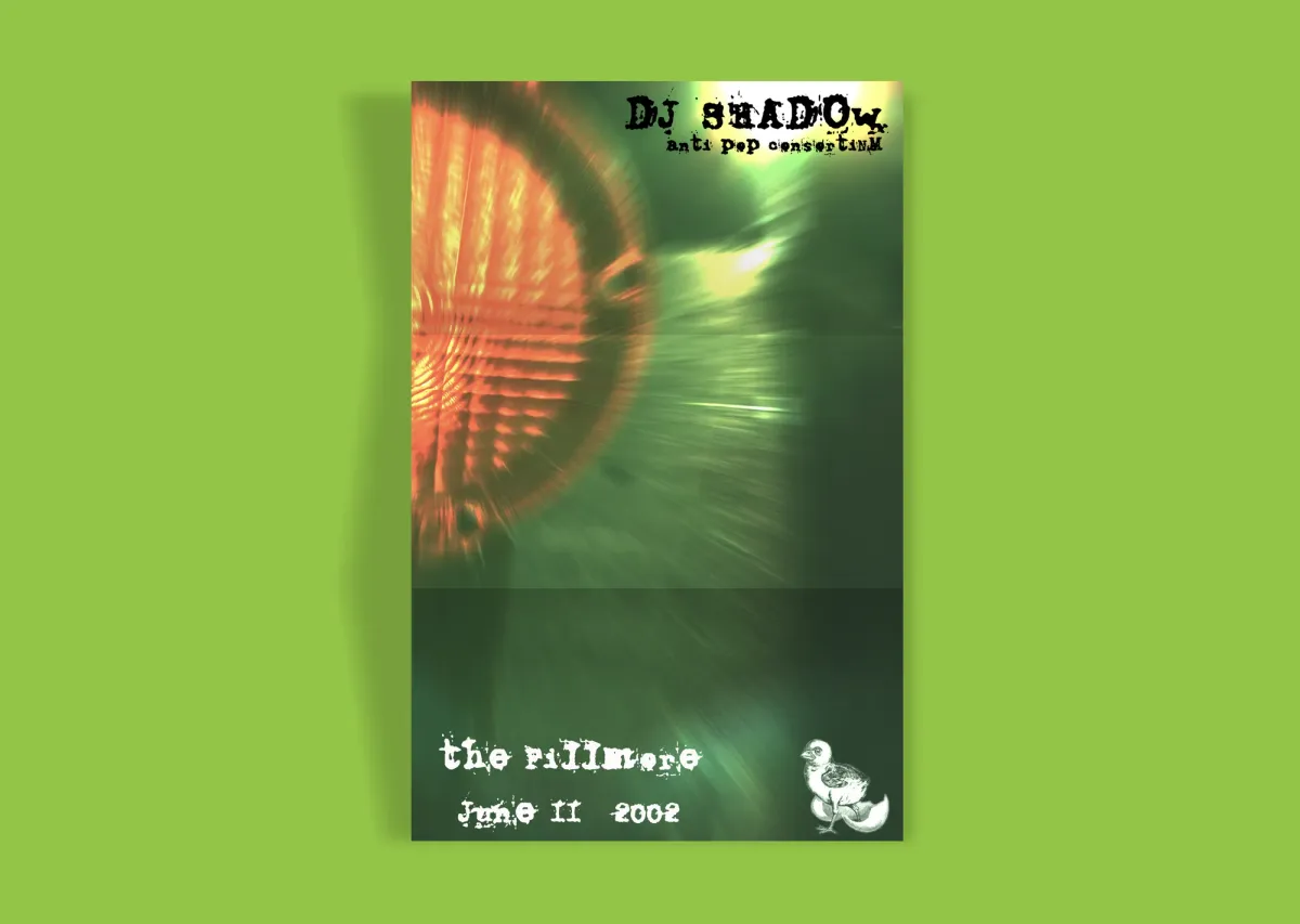
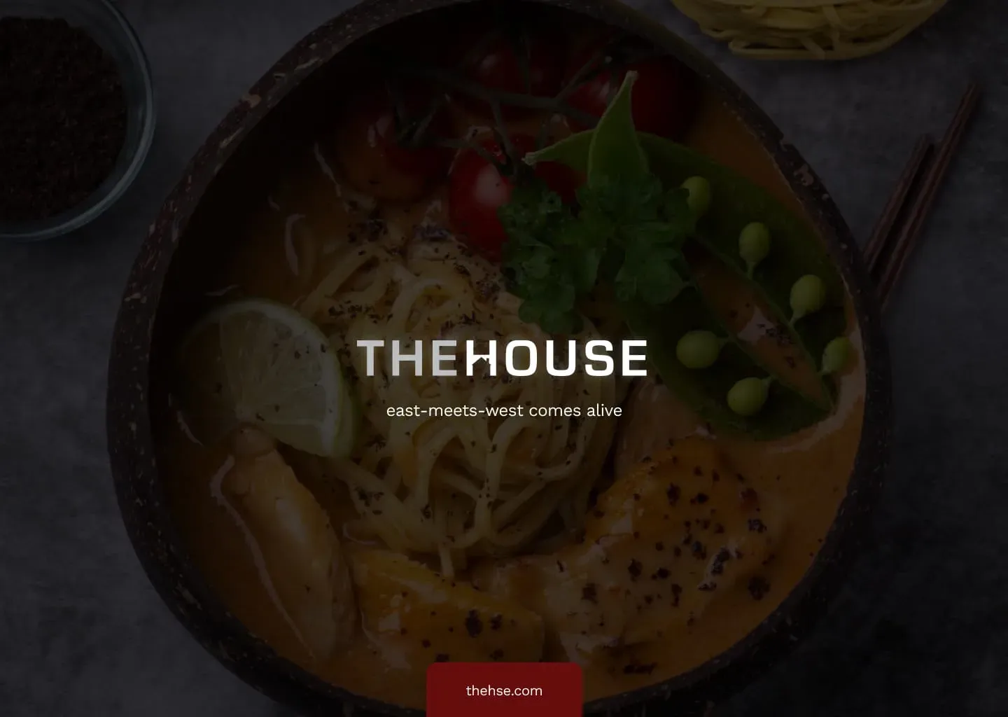
For the marketing collateral, including the poster and cover, the focus was on creating visually striking designs that would grab attention while communicating key messaging clearly. The poster design used strong imagery and typography to create a sense of energy and excitement, emphasizing the creative spirit of The House. I played with contrasts and geometric elements to balance the visual impact with legibility, ensuring that the messaging was both engaging and easy to digest.
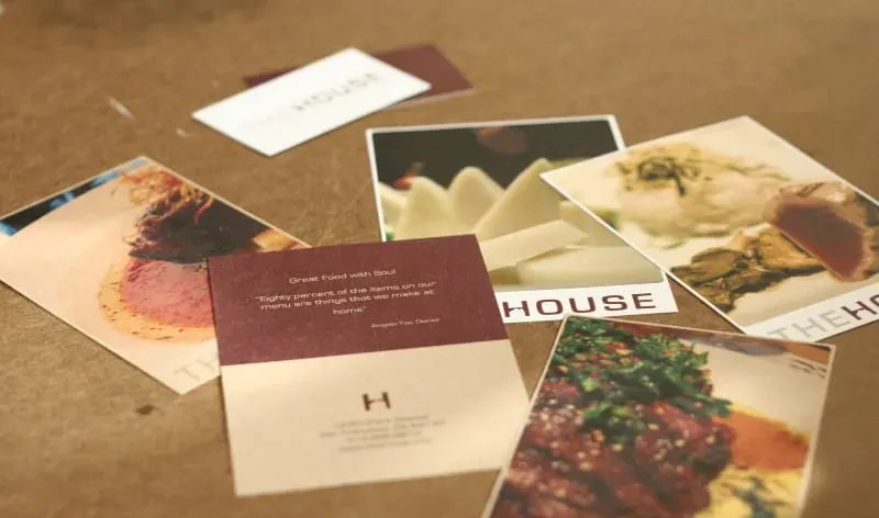
The cover design followed a minimalist approach, with clean lines and an organized layout that provided clarity while maintaining a sophisticated aesthetic. The design used ample white space, combined with bold typography, to ensure that it stood out without feeling overcrowded. The goal was to maintain a sleek, professional look while still evoking the creativity and innovation at the heart of The House.

Color Palette & Typography
The color palette was carefully selected to evoke energy, creativity, and warmth. Bold, vibrant hues were used to highlight key elements and create a dynamic, youthful feel, while softer tones were applied to balance the overall design and ensure readability. Typography was chosen for both its modern appeal and legibility. A mix of strong, sans-serif fonts paired with subtle accent fonts provided visual contrast, guiding the viewer’s eye and creating a strong yet approachable brand presence.
Final Implementation
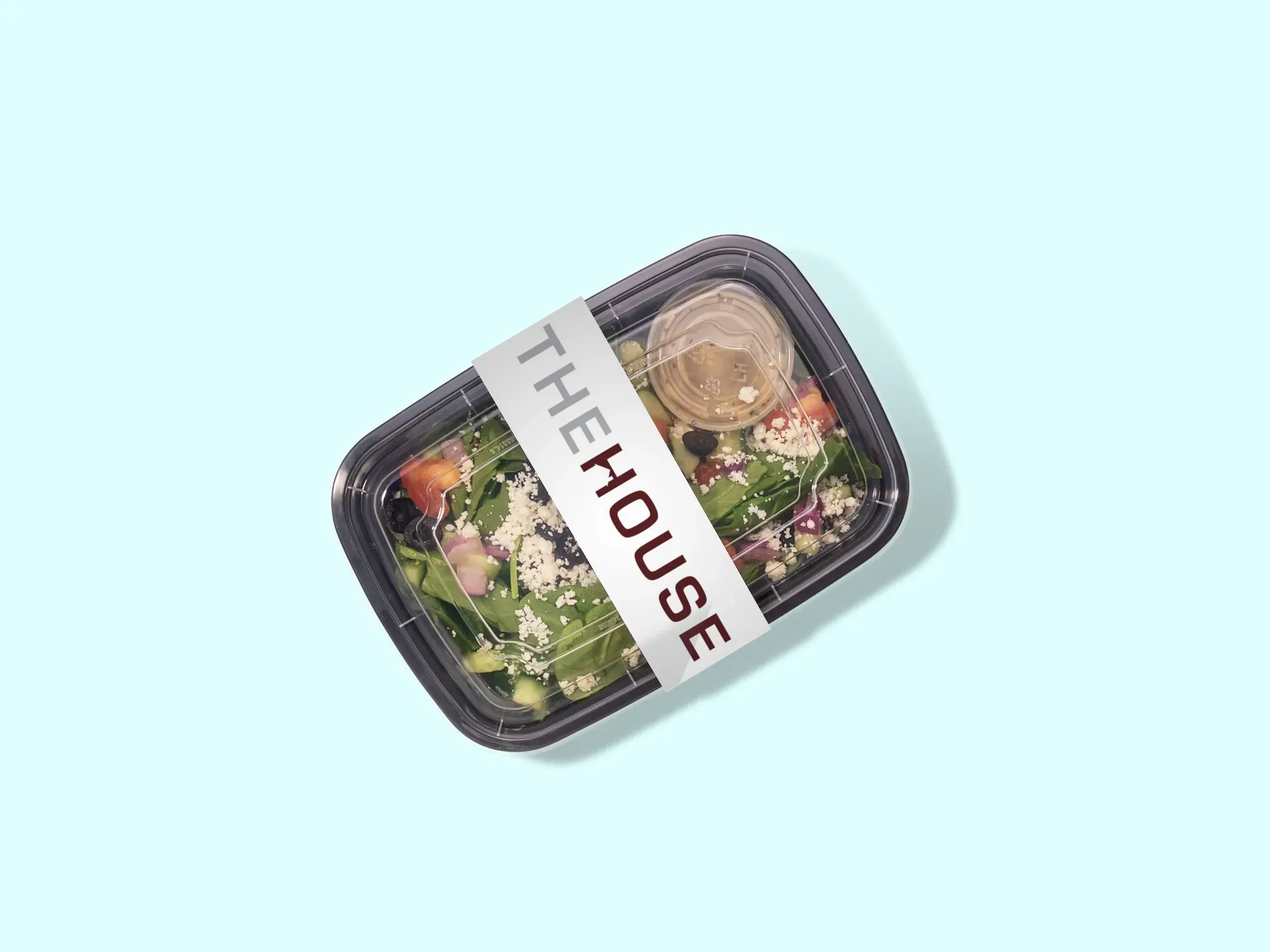
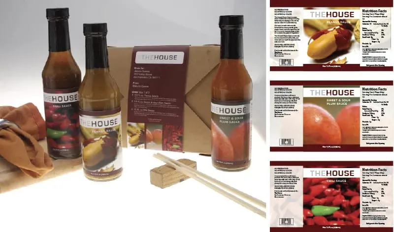
After finalizing the design concepts, the brand and marketing materials were adapted for both digital and print platforms. The collateral was produced with attention to detail, ensuring high-quality resolution and consistency across all applications. The design also included adaptable assets that could be used for future marketing campaigns, making sure the brand identity would remain flexible as The House continued to grow and evolve.
Results
The final brand identity and marketing materials for The House successfully communicated the project’s creative energy, professionalism, and modern approach. The cohesive design language allowed for flexibility in various contexts, from event promotions to digital content. Overall, the project was a strong representation of The House's mission to foster creativity and community, and it provided them with a memorable, visually impactful identity that stands out in a competitive market.
