Samsung Statement of Qualifications
Client: KMD Architects
Statement of Qualifications
Samsung International Hospital
Samsung Advanced Biotechnology Research Center
As the Art Director and Graphic Designer for this Statement of Qualifications (SOQ) submission, I was responsible for crafting a visual language that seamlessly aligned with both KMD Architects’ design philosophy and Samsung’s vision for advanced medical research.
This SOQ was more than just a presentation of credentials—it was an opportunity to create a tactile and emotional experience that resonated with the client. The cover and section dividers were designed to reflect the precision and innovation inherent in both architecture and biotechnology while maintaining a human-centric approach.
Creative Process & Design Analysis
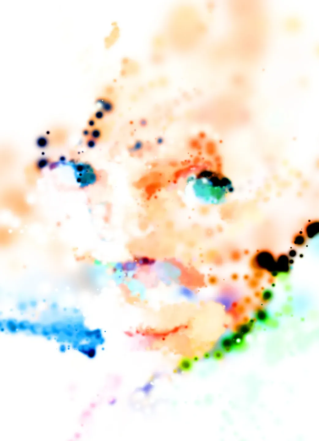
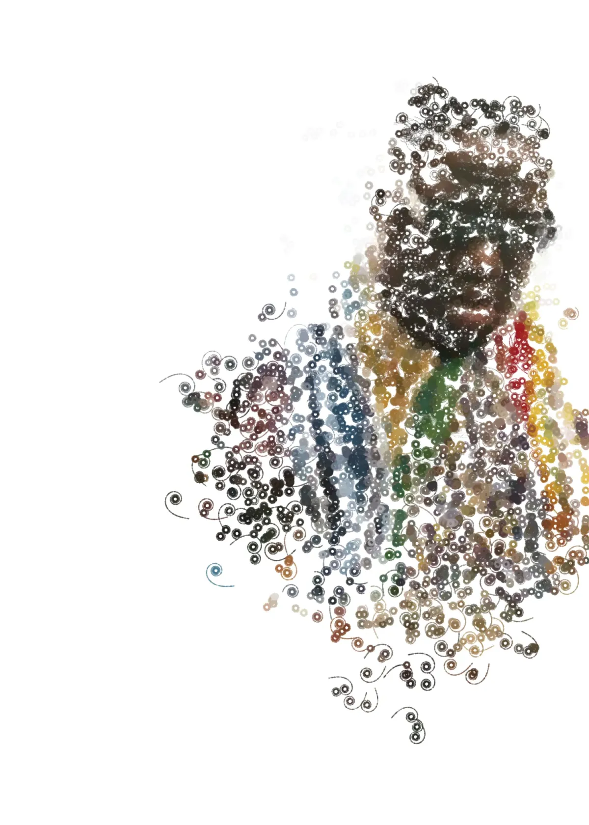
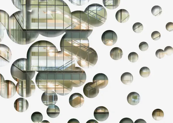
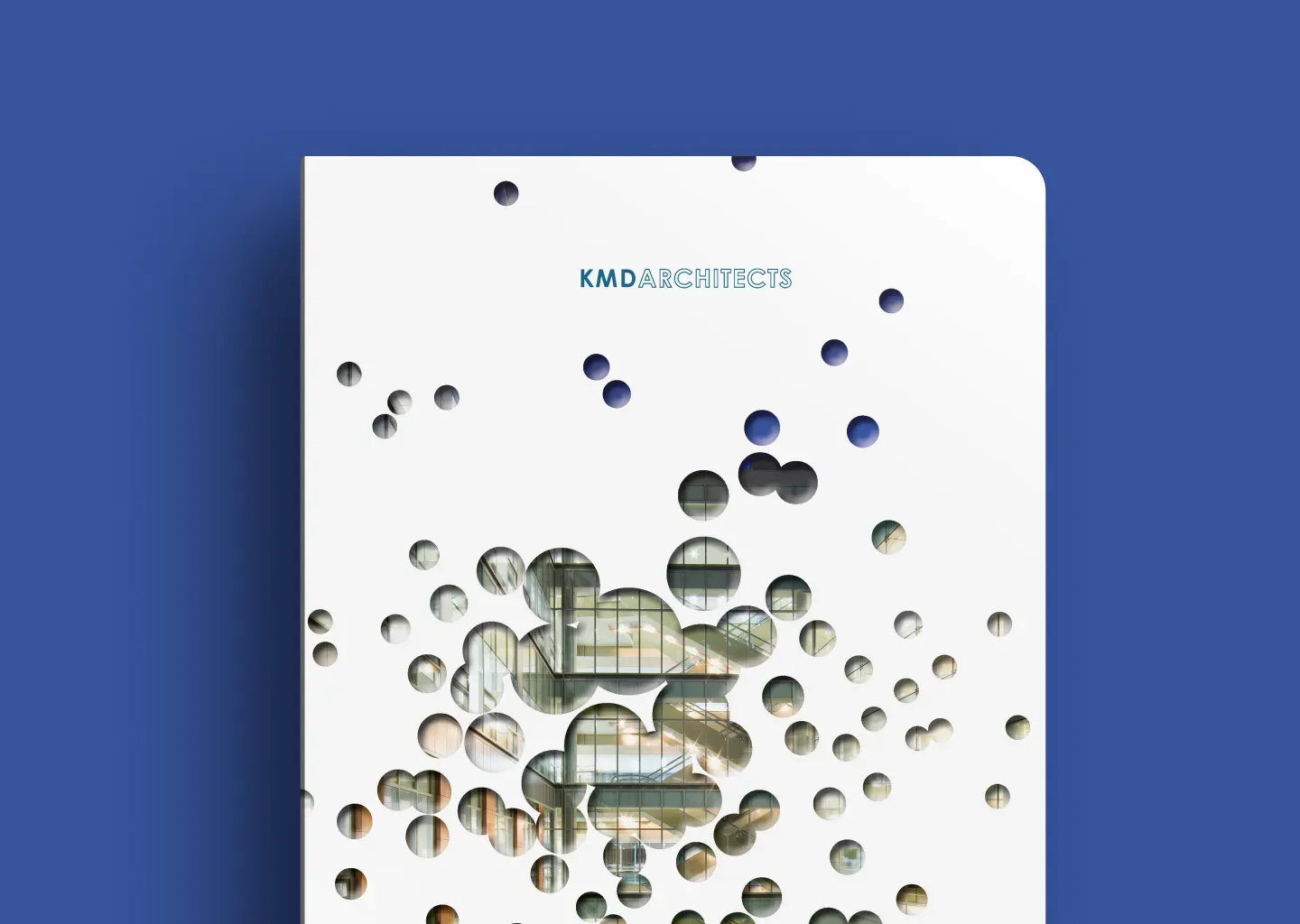
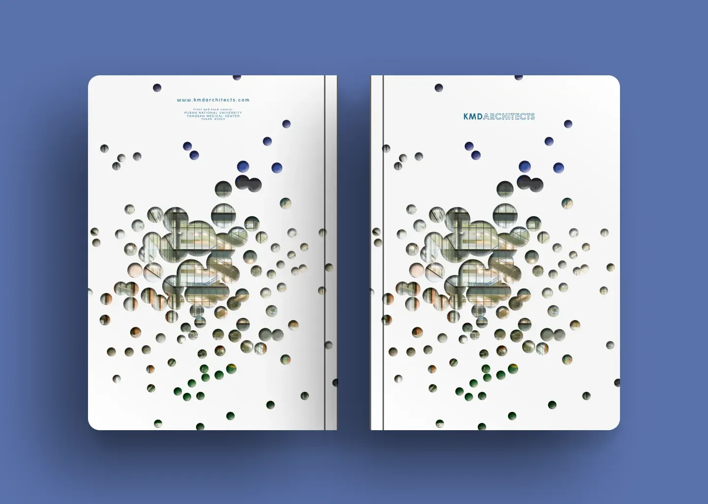
- Circle Masks & Emotional Impact: A defining element of the design is the strategic use of circular masks. These shapes do more than provide visual structure—they evoke a sense of discovery, focus, and connection. The circular forms reference cellular structures, the microscopic world of biotechnology, and the holistic nature of patient-centered care. They also introduce a rhythm throughout the document, guiding the viewer’s eye and creating a sense of flow and continuity.
- Concept-Driven Aesthetic: Inspired by the intersection of science and architecture, the design integrates organic and geometric elements. The perforated overlay effect on the cover adds depth, subtly reinforcing the idea of layers—whether in research, medical advancements, or architectural design.
- Architectural Photography Integration: Instead of traditional rectangular layouts, images are revealed through circular frames, making each moment feel curated and intentional. This technique highlights transparency, structural rhythm, and spatial composition, mirroring the architectural experience.
- Typography & Branding: A restrained, modern typographic approach keeps the focus on the imagery while maintaining a sense of refinement. The color palette—soft whites, deep blues, and warm neutrals—balances clinical precision with a sense of warmth and human connection.
- Material & Print Considerations: The final print execution emphasized texture and contrast, ensuring that the design not only looked sophisticated but also felt premium in hand. The interplay of gloss and matte finishes enhanced the depth of the masked elements, making the design feel tactile and dimensional.
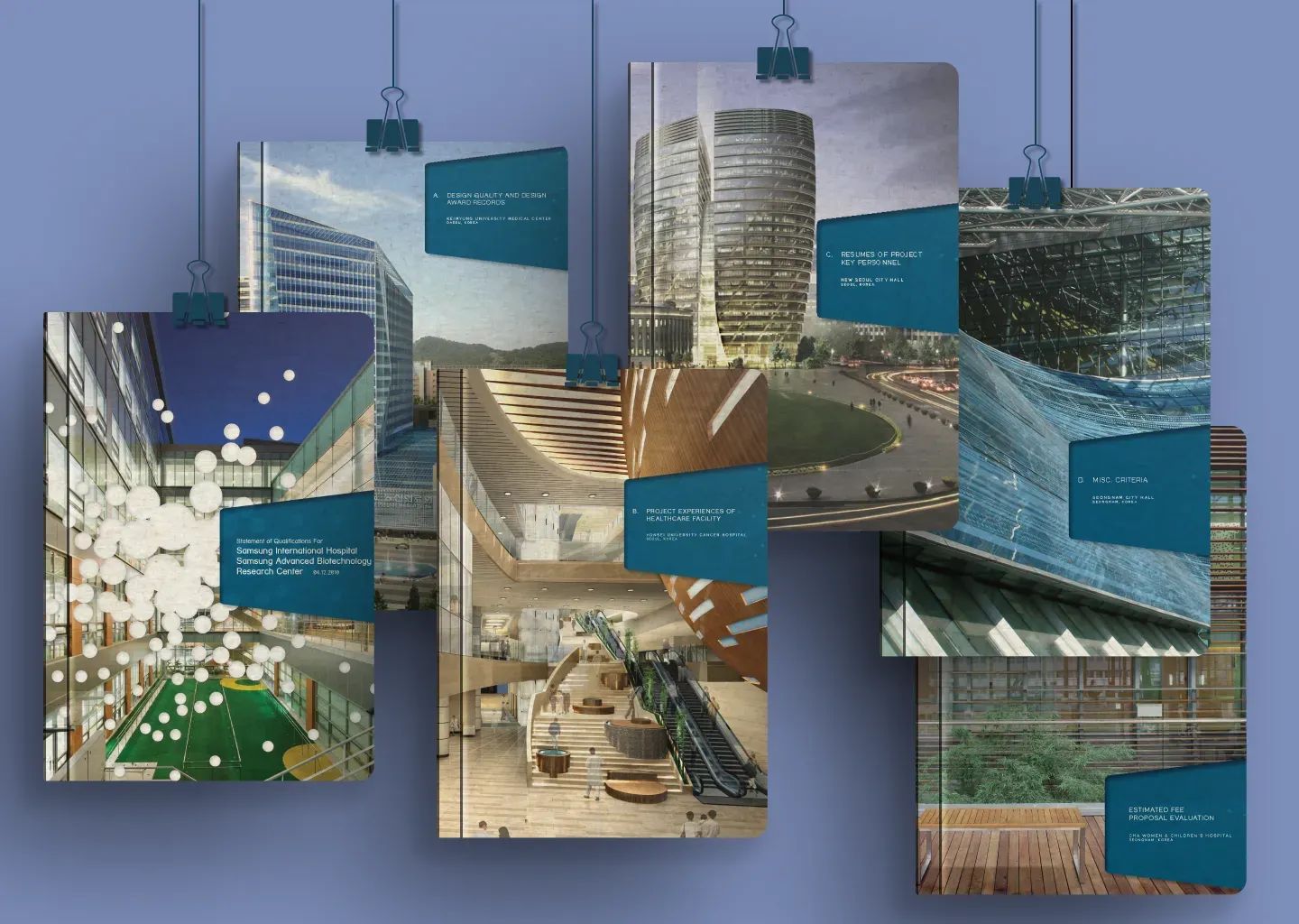
This project was an exercise in using design to communicate more than just information—it was about evoking emotion, curiosity, and a sense of trust. By merging architecture, biotechnology, and thoughtful graphic design, this SOQ became a compelling visual narrative that positioned KMD Architects as the ideal partner for Samsung’s vision.