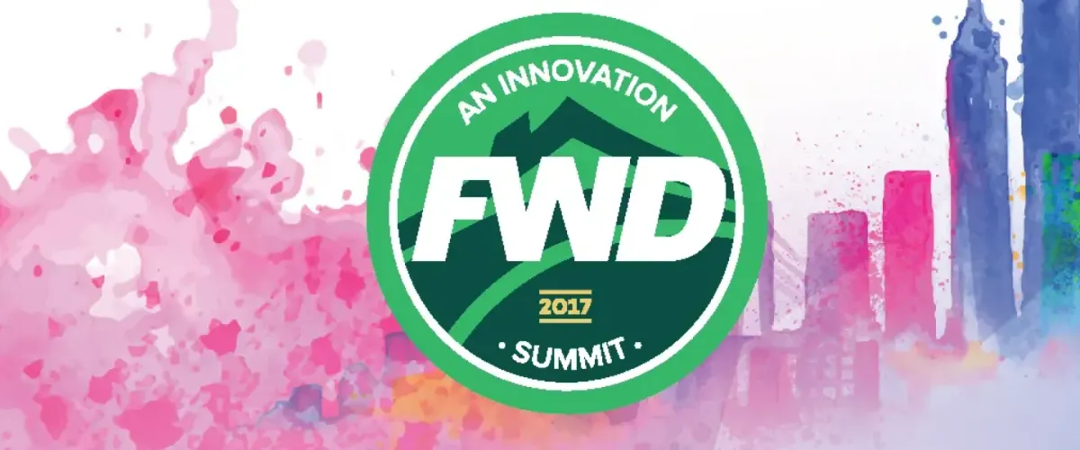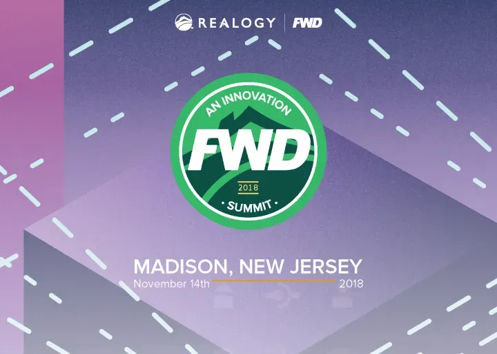
Realogy FWD 2018
Client: 1000Watt
Realogy Show Flyer
As the graphic designer for this project, my goal was to create a visually engaging yet highly functional flyer that aligned with Realogy’s brand identity while ensuring clarity and impact.
Design Approach
This flyer follows a clean, structured composition that guides the reader’s eye naturally from headline to key details. A strong visual hierarchy ensures that the most critical information is immediately clear, whether viewed at a glance or in-depth.
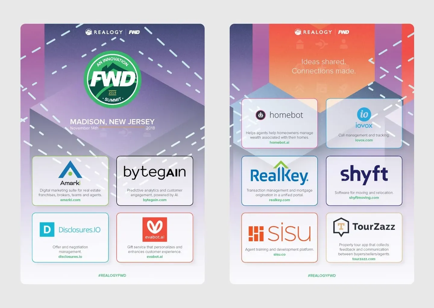
- Composition: The layout is balanced and intentionally structured to maximize readability. The strategic use of whitespace prevents clutter and keeps the design open and inviting.
- Typography: Bold, sans-serif fonts establish a professional yet approachable tone. The contrast between headline, subheading, and body text ensures effortless scanning and information retention.
- Color Palette: The design adheres to Realogy’s brand colors, reinforcing trust and consistency. The use of accent colors highlights important details without overwhelming the content.
- Visual Elements: Subtle graphic details and clean iconography support the message without distracting from it. Every design choice was made with function in mind—nothing is purely decorative.
Why It Works
This flyer is a great example of how design can be both beautiful and practical. It’s not just about making something look good—it’s about making sure the information is easily digestible, visually compelling, and brand-aligned.
Want a design that strikes the perfect balance between aesthetics and communication? Let’s talk.